base_map_testMake this Notebook Trusted to load map: File -> Trust Notebook
By Cian Prendergast
There’s a haunting beauty in the songs of the birds of Ireland. However, recent studies point towards a rather bleak reality. A whopping 54 species of birds, which equates to over 26% of the studied population, now find themselves on the endangered Red list. This is a clarion call for action.

To better understand and advocate for these birds, we delve into a dataset provided by Biodiversity Ireland. In this article, we will process and analyze this dataset, presenting our findings to highlight the importance of conserving these species.
Our dataset, initially a .txt file, was converted into a more manageable .csv format. Before diving into the data, let’s load our essential libraries:
import pandas as pd
import matplotlib.pyplot as plt
import seaborn as sns
While briefly reviewing the dataset, I observed that many longitude/latitude values were missing. These were predominantly from older entries (1990’s) that utilized the Irish OSI Map references. While converting these was beyond the scope of my available time, you can learn more at th OSI Co-ordinate Converter. Once the older OSI references were removed we were left with 48,172 rows!
The dataset was read into a DataFrame. Pay attention to the delimiter used to split the data, given the tab-separated nature of our dataset:
df = pd.read_csv(r"C:\Users\Cian\Workstation\Datasets\Bird_dataset.txt", "\t+|\t+", encoding='UTF-8', engine='python')We can have a quick look at the dataset using df.head()
RecordKey   StartDate   EndDate DateType    Date    TaxonVersionKey TaxonName   Longitude   Latitude    Grid Reference  ... Habitat description Abundance   Determiner name Survey name Common name Site description    Source  Habitat code (Fossitt, 2000)    Type of sighting    Activity
0   9.97173E+16 28/02/2022  28/02/2022  D   28/02/2022  NHMSYS0000530420    Lagopus lagopus -9.859652   53.883251   WGS84   ... NaN NaN NaN NaN NaN NaN NaN NaN NaN NaN
1   9.97173E+16 21/02/2022  21/02/2022  D   21/02/2022  NHMSYS0000530420    Lagopus lagopus -6.299050   53.037785   WGS84   ... NaN NaN NaN NaN NaN NaN NaN NaN NaN NaN
2   9.97173E+16 16/02/2022  16/02/2022  D   16/02/2022  NHMSYS0000530420    Lagopus lagopus -6.221776   53.156033   WGS84   ... NaN NaN NaN NaN NaN NaN NaN NaN NaN NaN
3   9.97173E+16 04/02/2022  04/02/2022  D   04/02/2022  NHMSYS0000530420    Lagopus lagopus -6.461017   52.940109   WGS84   ... NaN NaN NaN NaN NaN NaN NaN NaN NaN NaN
4 9.97173E+16 04/02/2022 04/02/2022 D 04/02/2022 NHMSYS0000530420 Lagopus lagopus -6.460975 52.940112 WGS84 ... NaN NaN NaN NaN NaN NaN NaN NaN NaN NaNThe initial exploration showed some rows with missing longitude and latitude data, which were removed for the sake of accurate geospatial analysis:
df.dropna(subset = ['Longitude', 'Latitude'], inplace=True)To ensure that our data truly represents bird sightings in Ireland, we plotted our latitude and longitude data. Our aim was to identify outliers that fall outside the geographical boundaries of Ireland:
# reference: https://github.com/Shreyas3108/house-price-prediction/blob/master/housesales.ipynb
plt.figure(figsize=(10,10))
sns.jointplot(x=df.Latitude.values, y=df.Longitude.values, size=10)
plt.ylabel('Longitude', fontsize=12)
plt.xlabel('Latitude', fontsize=12)
plt.show()
sns.despine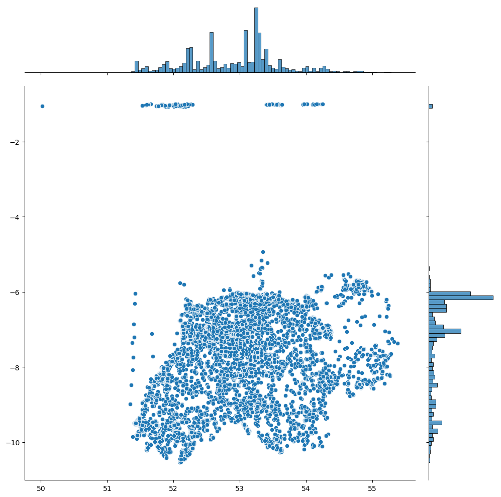
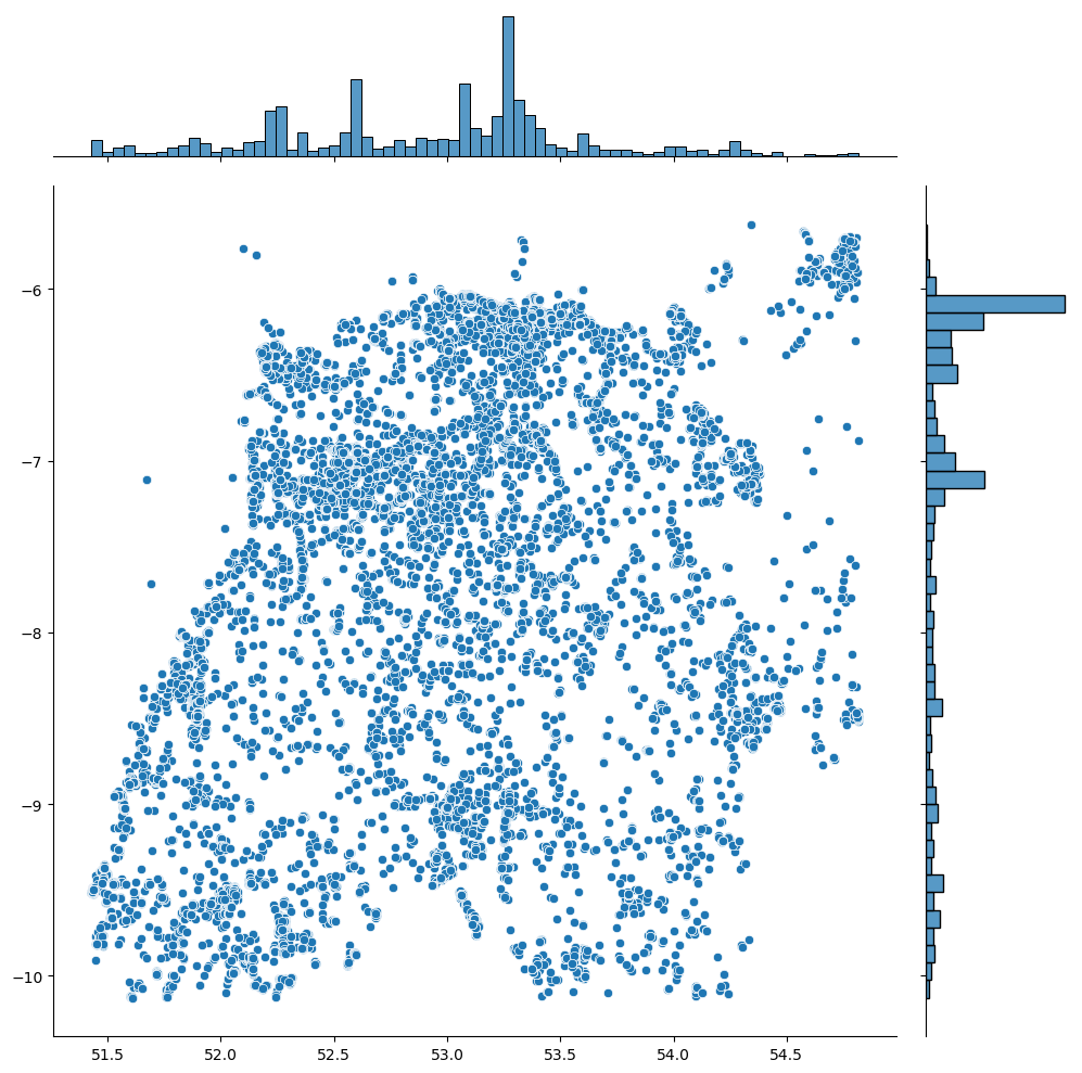
From this visual, outliers were particularly evident along the latitude, likely coming from UK locations. Using percentiles, we pruned the dataset to fall within the 1% to 99% range for both longitude and latitude:
# returns percentiles as a table
df[['Longitude', 'Latitude']].describe(percentiles=[.01,.05,.1,.25,.5,.9,.95,.99]) # maybe dipslay by two decomal point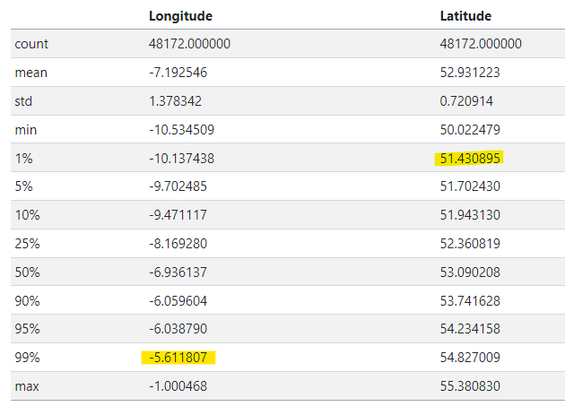
# Filter out outliers if needed by taking range between 1% - 99%
df_f = df[df.apply(lambda row: (-10.13<=row['Longitude']<= -5.61) and (51.43<=row['Latitude']<=54.82), axis=1)]
Now, our dataset is pruned to better reflect the geolocation of bird sightings in Ireland.
Next we’re going to walk through the process of converting cumulative counts into single counts per occurrence, a critical preprocessing step for more meaningful visualizations and statistical analyses!
First and foremost, we need our dates to be consistently formatted so that we can perform temporal analyses later. In the Python world, this is achieved using the fantastic Pandas library:
df['Date'] = pd.to_datetime(df['Date'])However, you might encounter the SettingWithCopyWarning. This warning is Pandas’ way of saying “Be cautious, you might be changing a slice from a DataFrame.” It arises when dealing with views vs. copies. You can find more about this in the Pandas documentation.
We’re moving away from cumulative counts and focusing on single occurrences. This simplification will aid in creating heatmaps later.
df['my_count'] = 1Again, you might see the SettingWithCopyWarning. Just a gentle reminder to tread carefully.
It’s essential to understand the unique counts of species (TaxonNames) to get a sense of the diversity in the dataset:
pd.set_option("display.max_rows", None)
print(df['TaxonName'].value_counts(ascending=True))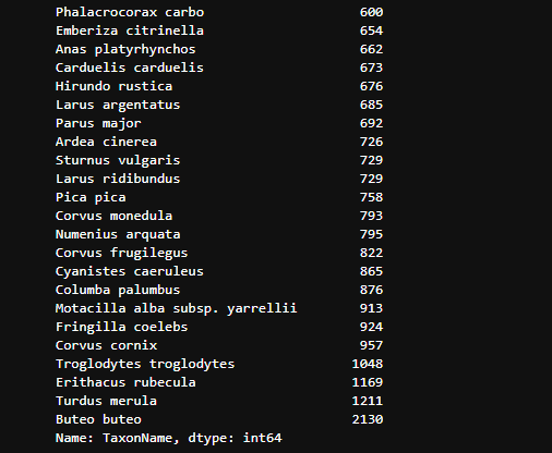
Also, displaying the total count per unique bird species:
for bird in df['TaxonName'].unique():
    print('TaxonName {}; has a total count of {:.0f}'.format(bird, (df[df['TaxonName'] == bird]['Total_Count'].max())))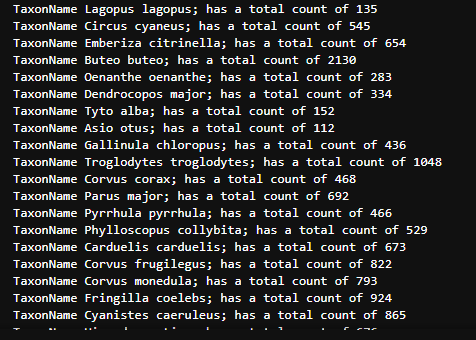
According to the Red List, bird species are classified into Breeding, Wintering, Passage, and Breeding&Wintering. Grouping them this way can provide valuable insights.
You can filter rows in a dataframe based on a column’s values. This link provides comprehensive ways to do this.
For instance:
df_b = df[df['TaxonName'].isin(['Coturnix coturnix', 'Perdix perdix', ... ])]By repeating this for all categories, we can get a count of the total number of bird species:
print("The number of bird species from Red List found in the dataset is: ", amount)Visualization is an integral component in the data analysis pipeline, offering a unique avenue to present complex datasets in a digestible format. But when we have temporal and spatial dimensions in the mix, the challenge arises: How do we efficiently display both? The answer is quite simply: Heatmaps.
Heatmaps are a fantastic way to visualize dense data. But when combined with time, they provide an animated sequence that’s both visually appealing and informative.
We will use the Folium library. With a combination of other plugins like HeatMap and HeatMapWithTime, we can create dynamic visualizations:
import folium
from folium.plugins import HeatMap, HeatMapWithTime
...
m = folium.Map(location=center, zoom_start=7, tiles='Stamen Toner')
...
hm = HeatMap(data=df_b[['Latitude','Longitude','my_count']]).add_to(m)
In the end, this preprocessing and visualization process gives us a vivid picture of the dataset’s richness. We can see not only the spatial density of bird species but also track their movements and concentrations over time.
First, we need our data in the right format. Given the dates from various dataframes df_b, df_bw, df_w, and df_p, you’d want to sort them:
df_b['Date'].sort_values().unique()After sorting dates from various datasets, we obtained a unique array of dates. The mentioned process is crucial because we intend to visualize data for each specific date.
array(['2003-03-10T00:00:00.000000000', '2004-08-29T00:00:00.000000000',
       '2004-12-02T00:00:00.000000000', '2006-07-01T00:00:00.000000000',
       '2006-09-21T00:00:00.000000000', '2008-12-07T00:00:00.000000000',
       '2009-03-08T00:00:00.000000000', '2009-08-26T00:00:00.000000000',
       '2009-09-23T00:00:00.000000000', '2010-03-08T00:00:00.000000000',
       '2010-04-08T00:00:00.000000000', '2010-07-08T00:00:00.000000000',
       '2010-08-09T00:00:00.000000000', '2010-09-13T00:00:00.000000000',
       '2010-09-16T00:00:00.000000000', '2010-09-17T00:00:00.000000000',
       '2010-09-21T00:00:00.000000000', '2010-10-17T00:00:00.000000000',
       '2010-10-23T00:00:00.000000000', '2011-01-09T00:00:00.000000000',
       '2011-03-09T00:00:00.000000000', '2011-08-19T00:00:00.000000000',
       '2011-08-20T00:00:00.000000000', '2011-08-21T00:00:00.000000000',
       '2011-08-31T00:00:00.000000000', '2011-09-13T00:00:00.000000000',
       '2011-09-17T00:00:00.000000000', '2011-10-10T00:00:00.000000000',
       '2011-12-09T00:00:00.000000000', '2016-11-19T00:00:00.000000000',
       '2017-02-12T00:00:00.000000000', '2017-10-15T00:00:00.000000000',
       '2018-01-15T00:00:00.000000000', '2018-04-18T00:00:00.000000000',
       '2018-05-03T00:00:00.000000000', '2020-08-26T00:00:00.000000000',
       '2020-10-09T00:00:00.000000000', '2020-12-09T00:00:00.000000000',
'2021-05-16T00:00:00.000000000'], dtype='datetime64[ns]')The power of folium comes into play when creating time-series heatmaps. First, we break down our data into hours for each category:
df_hour_list_b = []
for sale_date in df_b['Date'].sort_values().unique():
    df_hour_list_b.append(df_b.loc[df_b['Date'] == sale_date, ['Latitude', 'Longitude', 'my_count']].groupby(['Latitude', 'Longitude']).sum().reset_index().values.tolist())
In the code snippet above, for every unique date in our sorted dataset, we’re gathering data on Latitude, Longitude, and my_count. This helps in aggregating bird counts (or whichever entity is represented by my_count) at each unique geographic location.
Here’s where the magic happens. Using the organized data, we create a heatmap:
base_map_breeding = folium.Map(location=[53.305494, -7.737649], tiles='Stamen Toner',  zoom_start=6)
HeatMapWithTime(df_hour_list_b, radius=25, gradient={0.2: 'blue', 0.4: 'lime', 0.7: 'orange', 1: 'red'}, min_opacity=0.5, max_opacity=0.8, use_local_extrema=True).add_to(base_map_breeding)
The HeatMapWithTime function creates a time-series heatmap with a gradient color scale. This means the areas with higher bird counts would appear ‘red’, and those with lower counts will lean towards ‘blue’.
The method described above can be expanded for the other categories: df_bw, df_w, and df_p. The end result would be a series of heatmaps for each category.
Often, daily data can be noisy. To see trends better, you might want to group data by month:
df_months = []
for sale_date in df_b['Date'].sort_values().unique():
df_months.append(df_b.loc[df_b['Date'] == sale_date, ['Latitude', 'Longitude', 'my_count']].groupby(['Latitude', 'Longitude']).sum().reset_index().values.tolist())base_map_testIn the context of the provided code, these heatmaps can provide profound insights into patterns, be it the migration, population density, or any event-based clustering of birds in different geographical locations over time. By visualizing these trends, organizations and researchers can derive actionable insights, such as resource allocation for bird conservation, identifying hotspots for bird-watching, and understanding migration patterns.
Hope you had a great time reading this! 📚 For a deeper dive into heatmap techniques and visualizations, feel free to check out this article 📖 here and the GitHub repo 🖥️ here.
Also for the full code and datasets please see my own GitHub repo 🖥️ here.